Build Out Your PagerDuty Reports with Zoho
by David Shackelford
February 25, 2014
| 8 min read
Two of the most important metrics for any on-call team are Incident Volume and Mean Time to Repair (MTTR). Tracking how many incidents are coming into your system – and from which services – helps you identify both systemic infrastructure issues, and also misconfigured monitoring tools. Whether it’s a problem with the core system or just a monitoring threshold that needs adjusting, if you’re seeing dozens of incidents a day, there’s something there to fix!
Tracking MTTR helps show you how quickly your team is resolving issues. While incidents are always going to vary some in complexity, by looking at high-level trends in MTTR over time and across different escalation policies or services, you can start to identify opportunities to improve the way your team solves problems. Is one escalation policy consistently solving things faster than others? Maybe they’ve built more reliability into their system, or maybe they’re collaborating over HipChat or storing incident runbooks in the ‘notes’ field for each PagerDuty incident. Tracking MTTR outliers can help managers identify best practices as well as places to help struggling teams.
You can currently see some incident data in the PagerDuty “Reports” tab, but I wanted to build some additional reporting features to help us track down which services and escalation policies had unusually high (or low) incident volumes and MTTR.
I got a tip on a cool way to do this from our friends at Outbrain– they use Zoho Reports to query our API once an hour, then build dashboards from that data. After a few hours of wrangling with Zoho, here’s our report:
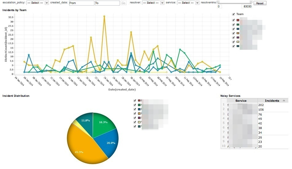
You can filter by date, escalation policy, assignee and service. You can also click into any data point to see details about the related incidents!
To start building your own reports, we’ve put together a quick guide to help you through the process. First, set up an account in Zoho Reports. You can get basic reporting with a free account. Paid versions are available, which add additional data allocations as well as private, shareable dashboards.
Basic Setup
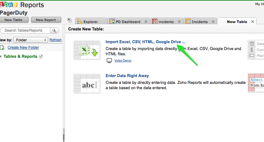
Create a new table, and choose “Import Excel, CSV, HTML, Google Drive….”
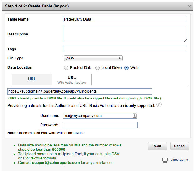
Choose “JSON” as the type, “Web” as the source, and enter the string “https://<your_subdomain>.pagerduty.com/api/v1/incidents” into the URL field. This calls the PagerDuty API for a list of incidents (more information).
Next, you’ll see a list of available columns. Feel free to remove some from the import, and if you’d like, double-click the headers to rename them into something more readable. Then click “Next.”
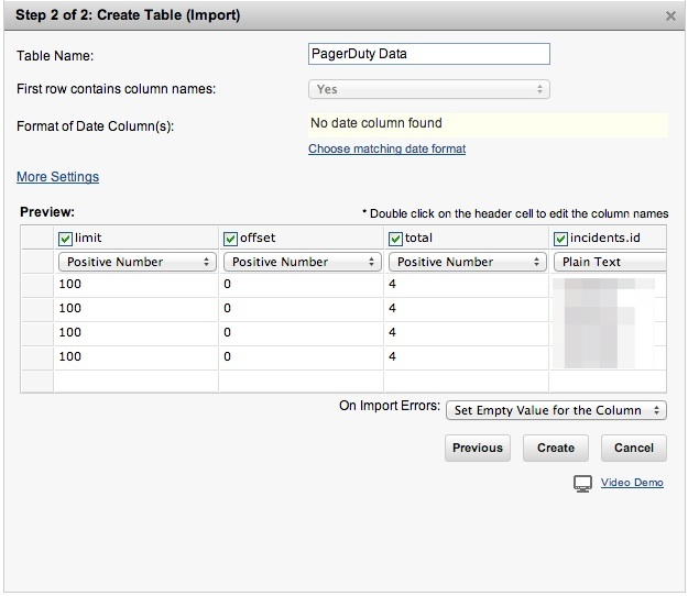
You should then see something like this– a table of all your incidents. If you’d like to clean it up a little (and didn’t pick and choose columns on import), click the button on the right to adjust which columns show, and in what order.
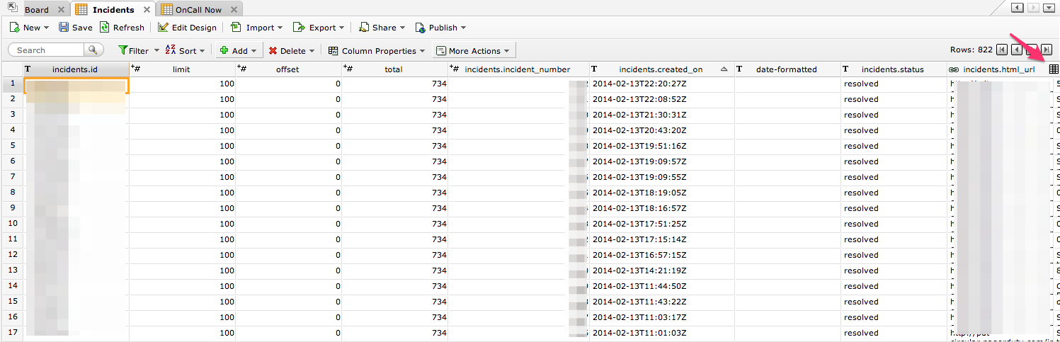
Populating the incidents table
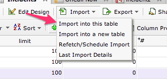
Now let’s get this table populated. The PagerDuty API has a row limit of 100, which means we can only get 100 rows of data on each call. However, we can add an “offset” parameter to our API call to control which row that 100 starts at. To start to fill up our table, first click “Import into this table.”
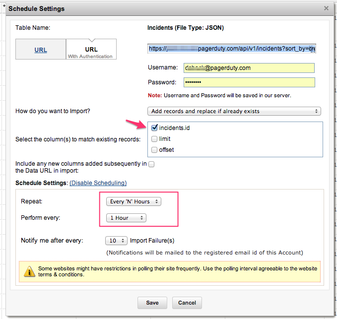
Select “incidents.id” as the column to match on, to make sure we don’t import duplicates. Then add “&offset=100” to the URL (you shouldn’t have to change anything else).
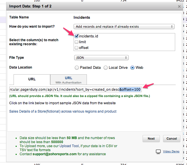
You’ll go through the same process of selecting columns to import, but shouldn’t have to change anything:
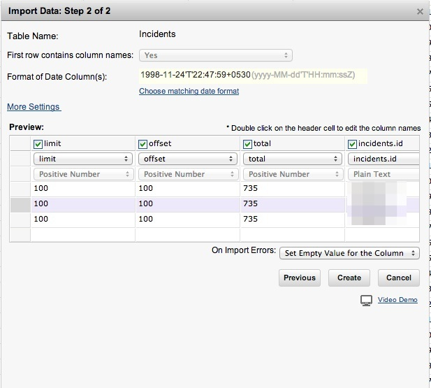
Click “Create” and you should have 100 more rows in your table!
If you want to import a lot of historical data, you’ll need to go through this process once per hundred records, setting offset to 200 the next time, then 300, and so on. If you have a large amount of data to import, you may want to call the API directly from the command line and use a script to dump the info to CSV.
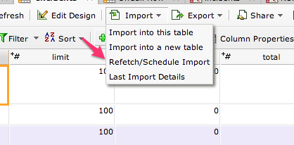
Finally, let’s set up Zoho to automatically grab new incidents as they come in. Click “Import,” then “Refetch/Schedule Import.”
You may see some information pre-filled here– if not, fill out the rest. For URL, make sure to use the URL without an offset parameter (ie “https://<subdomain>.pagerduty.com/api/v1/incidents”).
Set Zoho to pull data every hour:
Massaging our data
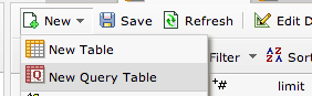
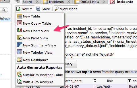
Now you have an incidents table in Zoho. If all you want to do is report on is number of incidents, you’re ready to go. However, if you’d also like to report on resolution time, we’ll need to do a little more work. Select “New,” then “New Query Table.”
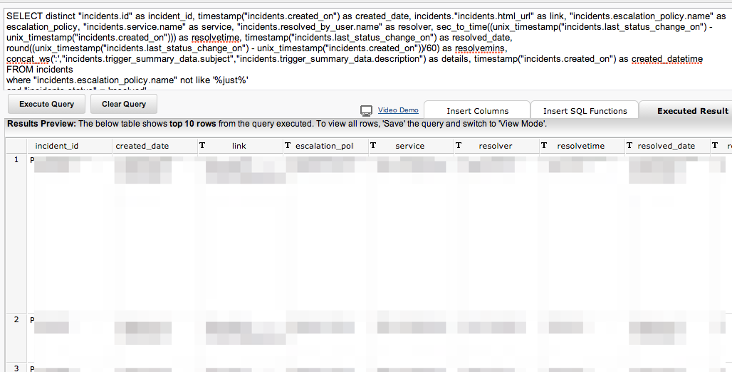
Query tables let you execute SQL commands against your base incidents table, which will help us get the data we want in a graphable way. If you know SQL, you’re probably good at this point. If not, here’s a sample query to get you started:
SELECT distinct “incidents.id” as incident_id, timestamp(“incidents.created_on”) as created_date, incidents.”incidents.html_url” as link, “incidents.escalation_policy.name” as escalation_policy, “incidents.service.name” as service, “incidents.resolved_by_user.name” as resolver, sec_to_time((unix_timestamp(“incidents.last_status_change_on”) – unix_timestamp(“incidents.created_on”))) as resolvetime, timestamp(“incidents.last_status_change_on”) as resolved_date, round((unix_timestamp(“incidents.last_status_change_on”) – unix_timestamp(“incidents.created_on”))/60) as resolvemins, concat_ws(‘:’,”incidents.trigger_summary_data.subject”,”incidents.trigger_summary_data.description”) as details
FROM incidents
WHERE “incidents.status” = ‘resolved’
Click “Execute” and you should see a new table appear below. This table is the one we’ll be doing our graphing from.
NOTE: You may be tempted to graph some metrics from your original table, and some from the query table. This will work, but doing everything from the query table enables some extra functionality I’ll explain later.
Graph Time
Now let’s make our first graph. From your query table, select “New,” then “New Chart View.”
Let’s make a graph that shows incident numbers by service over time. Whether it’s an infrastructure problem or just misconfigured monitoring thresholds, high incident volume is a sign that there’s something to go fix.
Drag ‘created_date’ into the x-axis, and set it to “Full Date.” Drag “incident_id” into the y-axis, and set it to ‘count.’ Then drag ‘service’ into the ‘color’ field – you can think of “color” as the variable that splits a column into multiple series. Click “Generate Graph,” and you’ll see something like this:
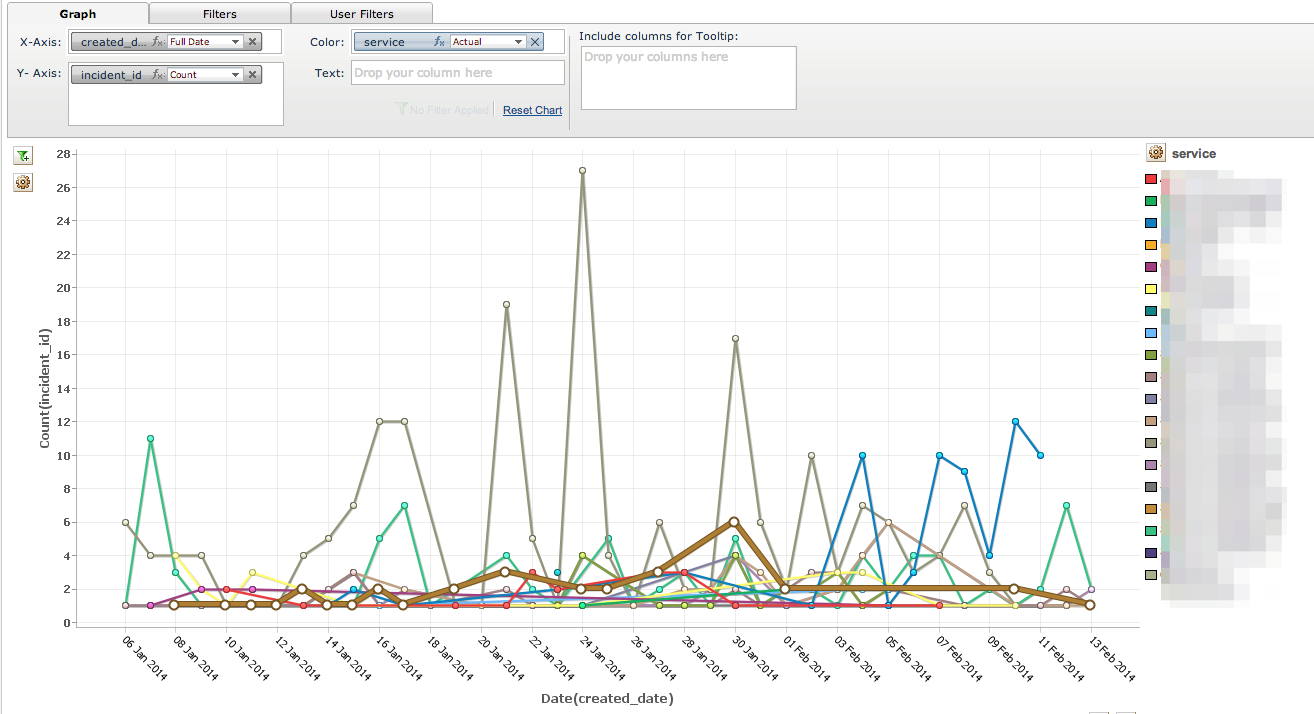
By clicking the different services on the right, you can control which services show. You can also use the “Filters” tab to include or exclude certain services (such as low-severity or test services).
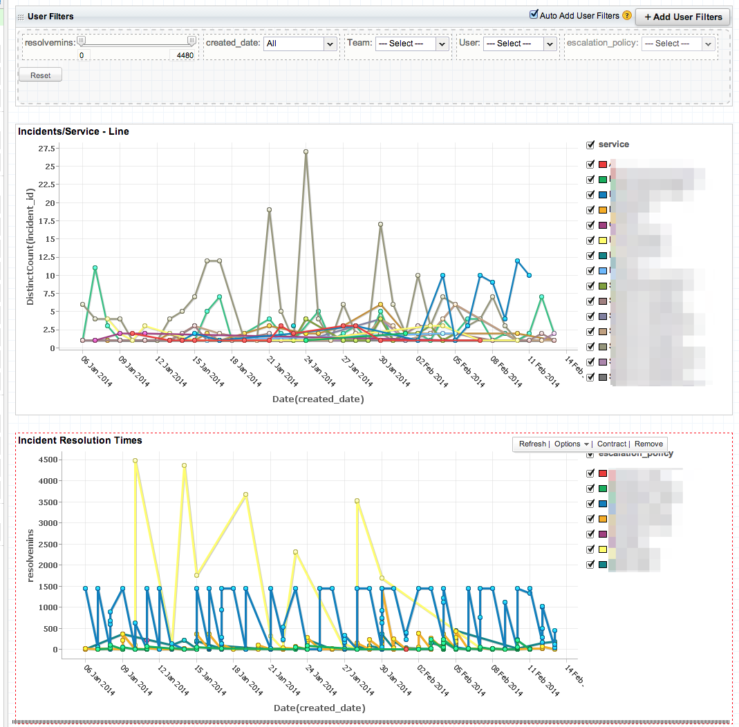
Now let’s add an escalation policy filter, so that you can see services broken down by team. Click the “User Filters” tab, then drag in ‘escalation_policy.’ Then click ‘View Mode.’
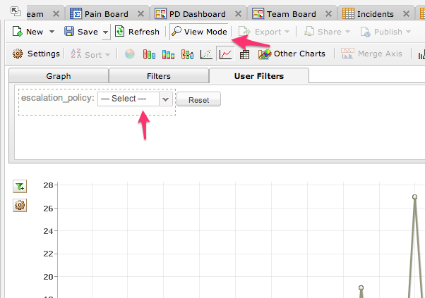
Now you can filter the list of graphed services by escalation policy! This is a big help for team leads who only want to see the services they are responsible for.

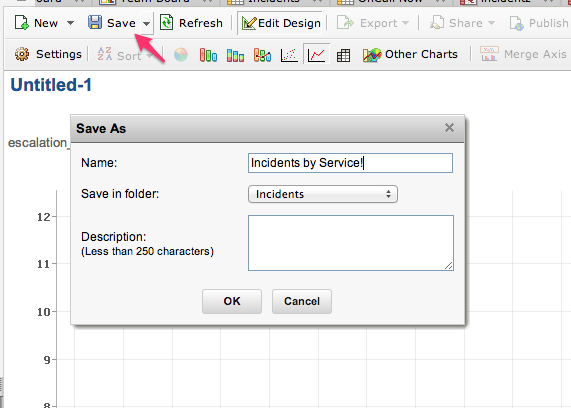
Go ahead and save your report, and give it a descriptive name.
Now let’s graph time-to-resolve, to show us how quickly our team is fixing problems. Make a new chart and put created_date on the x-axis, resolve mins on the y-axis, and escalation policy as “color.” I also like to add incident_id(count) to the tooltip box, so that mousing over a certain day will show me how many incidents there were as well.
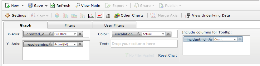
Over in “User Filters,” you can add whatever you’d like, but I suggest adding a filter for ‘resolvemins’.This will give us a ham-fisted way of excluding long-running incidents and getting a less noisy graph. Note to the math nerds out there: median or percentile would be a much better metric for resolution time. I’ll leave this exercise for you 🙂
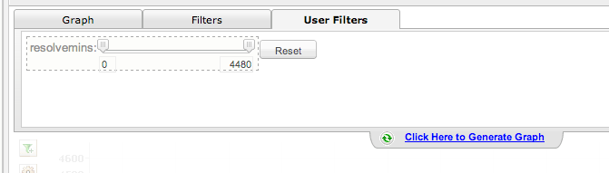
Click “generate graph,” play around with the various filters, and make sure you’re happy. Then save this report.
Putting it all together
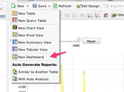
Finally, let’s build a company dashboard. Select “New Dashboard”:
From the left sidebar, drag in your two reports. You’ll see that the user filters from both reports are automatically added to the top! You can also add any other user filters you would like, and they will affect both of the reports on the dashboard.
When you’re satisfied with your dashboard, go ahead and save it. You can add additional graphical, tabular and summary views to your dashboard – my final one looks like this:
Sharing your report
Finally, let’s show off our awesome reports to other people at the company. To share a report or dashboard, just click the “Publish” menu in the toolbar:

You’ll be given links or embed code that you can use to share your graph around your organization (we embed ours in our Confluence wiki). Note that on the free Zoho plan, you’ll need to be logged in to view the dashboard, but paid plans offer public embeds as well.
We hope you enjoy! Thanks again to Outbrain for the tip.