Speed, Scale, and Special Sauce: The Evolution of the PagerDuty Brand
by Jesse Purewal
October 18, 2023
| 4 min read
At PagerDuty, our purpose is to empower teams with the time and efficiency to build the future. That means that our own teams are constantly building and relentlessly innovating to help organizations drive transformative change in the way they operate. Our business has come a long way since the early days of alerting and incident response–thanks to the adoption of the PagerDuty Operations Cloud by over 15,000 customers worldwide, we’ve become essential infrastructure for companies who need to transform their operations to compete and win as a modern digital business.
In some ways, our business at PagerDuty had gotten ahead of our brand. We’ve evolved from product to platform, grown alongside customers all over the world, and extended our relevance to include technical teams and business leaders. Now, we’re excited to announce the evolution of our brand.
Here are the truths upon which we’ve premised the evolution of the brand.
- PagerDuty is indispensable for enterprises in transformation, so our brand is taking a step forward to showcase greater speed, stability, and scale.
- PagerDuty is for people and teams, so we’re asking our brand to signal more vibrance, more energy, and more humanity.
- PagerDuty is a platform for building the future, and to reflect this, we’ve revitalized the brand with new elements that convey a modern, forward-looking, optimistic, inclusive point of view.
Not everything is changing. Our company name, logo and signature PagerDuty Green will stay at the core of the new identity system. And our voice and tone will remain clear, concise and human. What’s exciting to us about this brand evolution is that we’ve done it through the lens of “less is more”–that is, we stripped away elements that don’t help us tell the PagerDuty story (e.g., colors that limited accessibility, an outdated photo style, an overabundance of graphic devices) and allowed ourselves to discover even more beauty and practicality within colors, forms, elements and approaches that do serve our audiences well.
Here are a few new or refactored design elements that we’re particularly excited about:

A four-color gradient that signals the coherence of our Operations Cloud platform and modernizes the use of color for a mobile-first, digital-first brand experience
Waveform treatments that connote the speed, agility, and stability our customers demand
Icons that cleanly and clearly illustrate key use cases that are core to our customers’ success
A photography style that’s as dynamic and inclusive as our customers and partners

A new addition to our color family, Volt, which reflects the urgency of our customers’ transformation agenda and signals the speed with which PagerDuty can create value
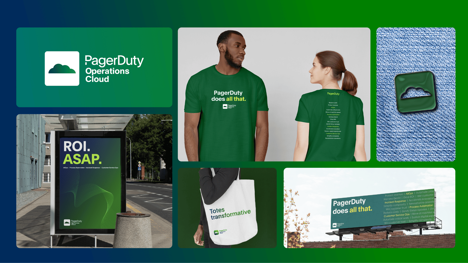
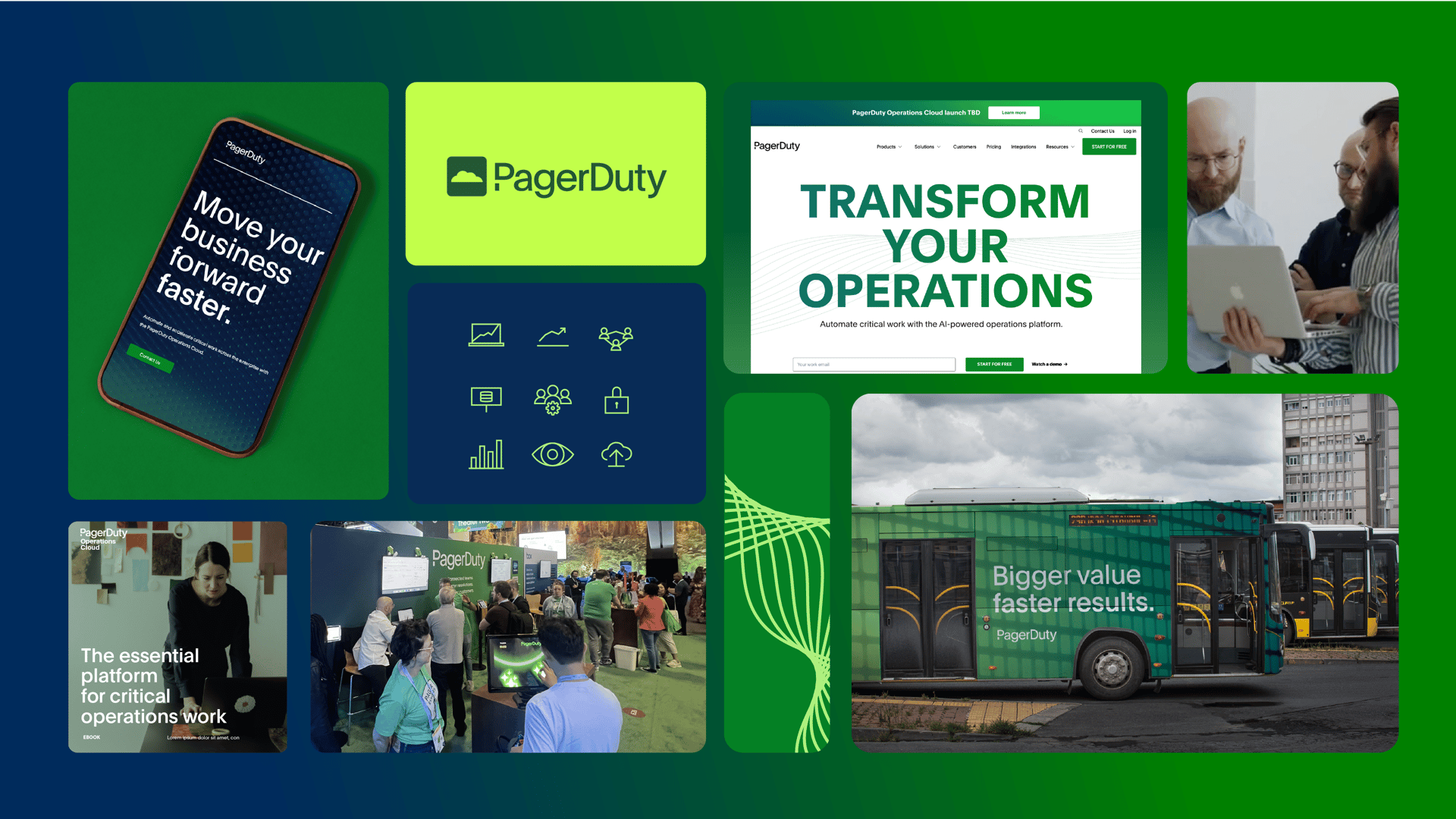
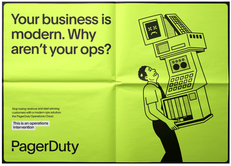
In connection with our brand evolution, we are also excited to announce the debut of our new brand campaign, “Operations Intervention.” It’s based on the fundamental insight that too many companies and teams are running their digital operations with inefficient workflows, slowed by context switching, and stuck in a hodgepodge of homegrown methods for managing critical work. The campaign, developed in connection with Instrument, empathizes with technical and business audiences and invites them to consider PagerDuty as a partner to help drive a change they know they’re past due for making – the modernization of operations to support the transformation to a modern digital business.
Shown below are some of the creative assets that will be used in connection with the campaign. Keep an eye out! You’ll see the campaign across social, web, podcasts, and even some out-of-home work in Las Vegas for AWS re:Invent 2023. A fun and practical microsite–where audiences can understand the linkages between their business challenges and the PagerDuty Operations Cloud–is also part of the campaign.
The evolution of our brand was done completely in-house, and we’re incredibly grateful to have a team of wildly talented creatives who re-imagined how we could tell a story of speed, stability, and scale while preserving – even enhancing – the “special sauce” that’s uniquely PagerDuty. Join me in saying their names: Erica, Matt, Eileen, Ryan, Allan, Carlton, Jay, Roua, Scott, Dan, Stephanie.
While we’re tremendously excited about this step forward for our brand, what doesn’t change is our commitment to you – our users, customers, and partners. Thank you for putting your trust in us, and we look forward to the journey ahead with you.
Onward!