- PagerDuty /
- Blog /
- Announcements /
- Refreshing PagerDuty’s Navigation for Increased Efficiency and Simplification
Blog
Refreshing PagerDuty’s Navigation for Increased Efficiency and Simplification
by Ruta Srinivasaraju
October 1, 2020
| 4 min read
We are super excited to share that we are currently testing and in the process of rolling out a new desktop global navigation to all of our users.
Things that are clear in retrospect often emerge from ambiguous and humble beginnings. Initially built as a simple on-call management tool for IT responders, PagerDuty has evolved into an end-to-end, enterprise-grade digital operations platform. And while the innovation behind the technology has been consistent, our navigation menu hasn’t always been able to keep pace. The legacy menu created challenges for our users to discover and efficiently navigate between different tasks, which slowed them down and didn’t enable them to take advantage of the full potential of PagerDuty’s capabilities.
Feedback from customers has shown us that our end users have been experiencing numerous pain points related to how our navigation is structured. One of the more common complaints was that the old menu required too many clicks, and users often had to drill down numerous levels to access important functionality. Another problem we found was that customers weren’t aware of all the available features because said features were buried too deep in the application and not easily discoverable. And, too often, we heard that the configuration menu was bloated and disorganized.
To alleviate these pain points, we identified three primary objectives:
1. Restructure our navigation to decrease ramp-up time for new users and make it easier for all customers to find and access the tools and information they need to optimize productivity.
2. Improve the discoverability of new features and capabilities, and increase engagement to ensure customers can get the most out of using PagerDuty.
3. Update the overall visual design of our global navigation to be in line with best-in-class, consumer-facing applications.
Check Out What’s New
We conducted extensive research and testing to develop a new menu that is optimized for all types of users. The process included things like discovery research and incorporating interviews, surveys, analytics, card sorting, as well as tree testing activities. We then identified two potential approaches and compared them via an A/B test on a select subset of users. The two competing menus were compared on various measures, including metrics such as efficiency, discoverability, and success rate on high-value actions. The winning navigation menu was then selected for implementation across the entire PagerDuty web application.

The new global navigation consists of five top-level menu items:
1. Incidents
2. Services
3. People
4. Analytics
5. Status
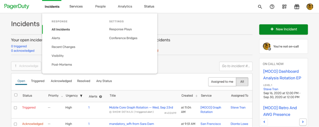
Under the Incident’s dropdown menu, rather than having a single link that provides access to open incidents on your system, the new incident category contains links to multiple tools that a responder might need to use when resolving an incident, including PagerDuty’s Visibility Console and Postmortem functions. We’ve also provided access to settings related to on call for things that need to be prepared ahead of time, like Response Plays and conference bridges.
Services
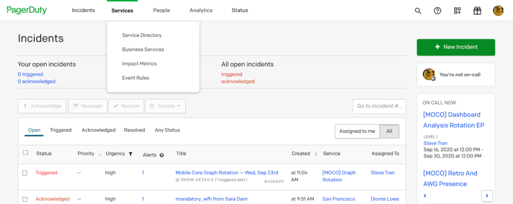
The Services drop down menu is now optimized for completing administrative tasks such as setting up services, event rules, and other back-end capabilities.
We also show the “Learn More” section along with the main navigation to introduce our users to new features or things like key community topics.
People
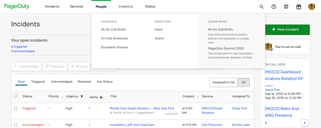
The new People menu contains all the information pertaining to users, schedules, escalation policies, and team management.
Analytics
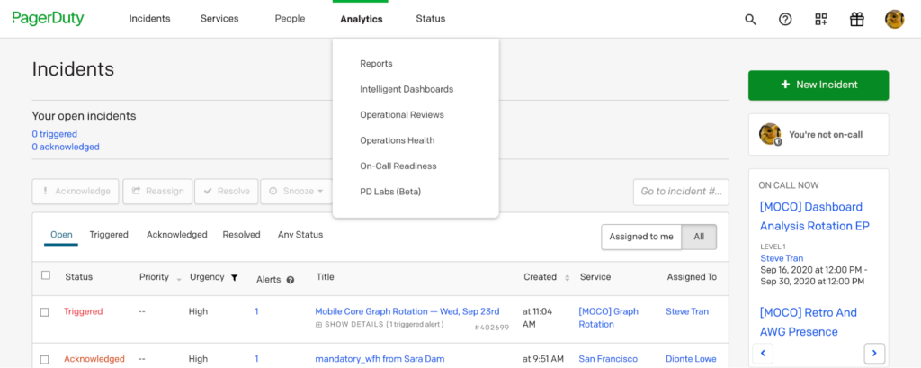
The Analytics menu contains links to reports and dashboards that provide insight into how well your system and teams are performing.
The Status menu links directly to the Status dashboard for a real-time overview of your business services.
Right Side Menu
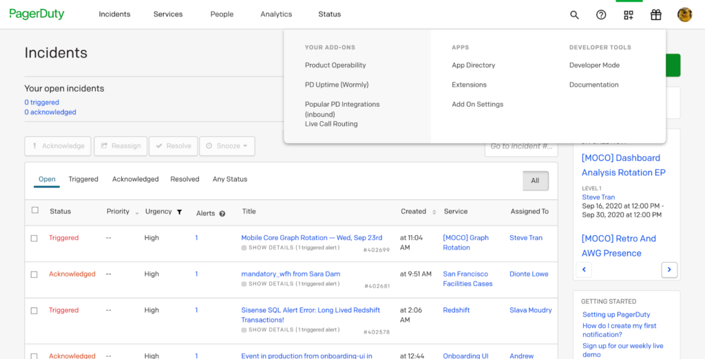
We’ve also updated the right side of the menu to make it easy to access information about profile details and account subscriptions, view the extensions, integrations, and add-ons you have installed, and added a help section to contact support when needed.
Finally, we’ve made sure to include a search bar to make it easy to find and view the information that you need. Because we are continually expanding the capabilities that the PagerDuty platform provides, we’ve included a “What’s New” gift icon to showcase the latest product innovations and features that can bring your teams even more value.
Thank you to the hundreds of users who gave their time to validate our information architecture, participated in our user testing studies, and engaged live in our A/B studies to pick a solution that works across different packages and segments. We couldn’t have done it without your feedback, collaboration, and support. We’re rolling out the new navigation to all our users in the next few weeks, so keep an eye out!