- PagerDuty /
- Blog /
- Announcements /
- PagerDuty: Empowering People in Moments of Truth
Blog
PagerDuty: Empowering People in Moments of Truth
by Jennifer Tejada
September 10, 2019
| 3 min read
Our founders created PagerDuty with the simple goal of making the lives of on-call developers better—and in doing that, we’ve championed a new way of working, inspired by the DevOps mindset.
From that starting point, we’ve evolved our on-call product into a platform for real-time operations that enables our customers to grow from on-call rotations, to incident management and response, to full digital operations management. As we’ve grown, we’ve never lost sight of the people who trust us to be there for them in their moments of truth, and this commitment is at the heart of our brand promise:
“Empowering People in Their Moments of Truth”
When websites go down, shopping carts freeze, or refrigeration in delivery trucks fail, PagerDuty is there to help teams respond when moments matter and prevent the same issues from happening in the future. Responders know that PagerDuty will help them sleep through the night or enjoy dinner with their family, confident they aren’t missing critical incidents. Business leaders know that PagerDuty understands their need to deliver a perfect digital experience to each of their customers every time.
As we’ve evolved, we needed our brand to evolve with us, helping us communicate the possibilities of the PagerDuty platform while bringing a new way of working to a broader set of teams, including ITOps, SecOps, Support teams, and many others.
So today, we’re introducing new branding. And while much of what we love about our brand stays the same, we’re enhancing it with new elements, including patterns, colors, typography, illustration, and a new logo—each inspired by the DevOps mindset that is integral to what we do and who we are.
Here are some examples of the new brand elements that you’ll see from us today: on our website, in our product, and in marketing materials, as well as in a brand campaign launching this month.
Patterns that mirror the different types of activities during an incident, including collaboration, amplification, and resolution.

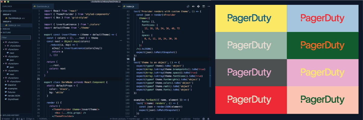
Colors that highlight what’s important and help direct work, inspired by the world of code.
A new style of photography that features two distinctly different angles:
Zoom out photography communicates the visibility to the whole system that is essential in complex and, at times, chaotic systems. It also represents the scale of impact our customers can have on their business and our daily lives. Zoom in photography celebrates the very human aspects of the moment of truth.

And a streamlined logo to fit into any situation, just like we do.
![]()
While we’re evolving our brand, what doesn’t change is our commitment to you—our users and customers. Thank you for placing your trust in us and we look forward to the journey ahead with you.