- PagerDuty /
- Blog /
- Announcements /
- Touching up our Web UI
Blog
Touching up our Web UI
by David Hayes
August 29, 2013
| 2 min read
Over the next couple of days, you may notice that our webapp is getting a minor facelift. We’ve always been a team of engineers first, but we’ve hired UX minded engineers as well now and it’s starting to show:
- The changes are slight. We’ve made button locations and styling standardized, more intuitive and focused on the content so the UI is easier to read — which should help everyone, and new users especially. We’re also standardizing the icons everywhere (and switching to font icons).
- We switched CDNs, making our static assets load 20% faster on average, especially for international users.
- We’ve also enabled compression on our APIs, making everyone’s access faster.
- You can now re-assign a triggered incident to a different escalation policy in addition to a user.
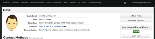
- You can change the a user’s color on the calendar, just in case your team were all assigned shades of green. We’ve also showing push notification rules on the users page.
- Our great support team has been working hard on the PagerDuty knowledge base, so we’re making our inline help a little easier to find.
- The dashboard now automatically refreshes.
- And a bonus feature! If you want to use the dashboard as a kiosk you can make it fullscreen by pressing F.
It’s a minor change in terms of functionality but we’re excited to be making strides in usability – the mobile app is next. As always, any questions are welcome.