
- PagerDuty /
- Engineering Blog /
- Building a DateTime Picker in Ember.js (Part 1)
Engineering Blog
Building a DateTime Picker in Ember.js (Part 1)
by Derrick Camerino
June 13, 2017
| 5 min read
I recently attended EmberConf 2017 and there was an interesting talk on Higher Order Components by Miguel Camba (I highly recommend watching if you haven’t already). Coincidentally I was also in the process of building a datetime picker for PagerDuty, so this talk was very relevant to the work that I was doing at the time.
Miguel described a pattern of having a container component and having subcomponents nested within. This pattern is useful when having a complex UI component that may have multiple components working together.
This concept and the DDAU (Data Down Actions Up) paradigm had a big influence on the design. I’ll illustrate by going into the component architecture of the datetime picker that I implemented with a colleague. I named it datetime-selector so moving forward, I’ll refer to it by that name.
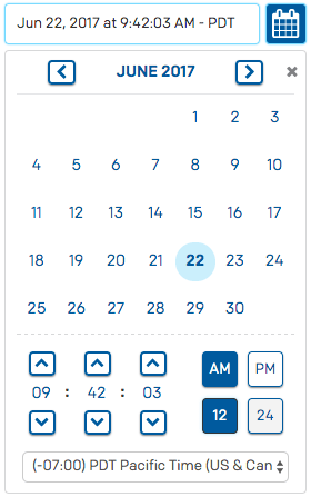
The screenshot above is the finished product. It’s essentially a text input such that when clicked, it shows the datetime picker controls below. In the dropdown content, there’s a calendar for picking a date, number controls to select a time, buttons for am/pm & 12/24 hour rendering, and a select input for timezone. When changing any of properties (like hour, minute, second, timezone, etc), the change will reflect in the textfield.
Components Implemented
Thinking in terms of components, this is about 4-6 components, where they all need to be in sync with whatever the currently selected date is. This is the way I constructed it:
drop-down
This component is a thin wrapper around the ember-rl-dropdown component. It handles the showing/hiding of the datetime picker controls.
datetime-selector
This is the container component that holds everything together. It is home to the date, am/pm, 12/24, and timezone properties, which end up getting passed into the relevant child components. It also has the actions to change them which also get passed into the relevant child components.
power-calendar
ember-power-calendar is an ember addon for the date picker (just renders a calendar and has logic for date selection).
time-selector
This is a container component for all of the time related controls.
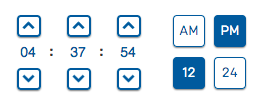
number-control
This component simply increments/decrements a number using the up/down buttons. You can also provide min/max values and a boolean argument prefixZero to render a single digit number prefixed with a 0 (like the screenshot below).

timezone-selector
This is a select input with all of the timezones.
pd-button
This is a simple button component that is used for the am/pm, 12/24, up/down, and next/previous month buttons.
Putting the Puzzle Pieces Together
While I won’t dive into the specific implementation of each component, what I want to focus on is the interaction among the components. Let’s start at highest level component datetime-selector.
The datetime-selector component is the container component (aka the glue code) that also is the one source of truth of the date & time. The component essentially looks something like this:
// computed properties of datetime-selector
export default Ember.Component.extend({
  classNames: ['datetime-selector'],
  is24hourTime: true,
  date: computed(function() {
    return moment();
  }),
  isAM: computed('date', function() {
    return this.get('date').hour() < 12;
  }),
  timezone: computed('date', function() {
    return this.get('date').tz();
  }),
  // Format the date as something like `Jun 12, 2017 at 4:37:54 PM - PST`
  renderedDate: computed('date', 'is24hourTime', function() {
    let hourMomentToken = this.get('is24hourTime') ? 'HH' : 'h';
    let meridiemMomentToken = this.get('is24hourTime') ? '' : 'A ';
    let date = this.get('date');
    return date.format(`MMM D, YYYY \\at ${hourMomentToken}:mm:ss ${meridiemMomentToken} - z`);
  }),
As seen above, the datetime-selector has all of the values that will eventually be fed into the child components (i.e. power-calendar, time-selector, time-zone-select).
The template for datetime-selector looks something like this:
{{#drop-down as |dropdownExpanded|}}
  {{#drop-down/toggle}}

  {{/drop-down/toggle}}

  {{#drop-down/content dropdownExpanded=dropdownExpanded}}

    {{#power-calendar selected=date
                      onSelect=(action 'changeDate')
                      onCenterChange=(action (mut date) value='moment')
                      center=date as |calendar|}}
      {{calendar.nav}}
      {{calendar.days}}
      {{time-selector is24hourTime=is24hourTime
                      isAM=isAM
                      date=date
                      onTimeChange=(action (mut date))
                      onMeridiemChange=(action (mut isAM))
                      on24hourTimeChange=(action 'changeHourFormat')
      }}
      {{time-zone-select value=(readonly timezone)
                         onTimezoneChange=(action 'changeTimezone')
      }}
    {{/power-calendar}}
  {{/drop-down/content}}
{{/drop-down}}
Notice how the datetime-selector component renders each subcomponent passing in the relevant computed properties and actions to call when changing the values. This pattern adheres to the DDAU (Data Down Actions Up) paradigm. Another thing to notice is the use of the mut template helper.
What is mut?
mut is a helper to specify that a child component can update the value passed to it. In most cases, I rarely use it on its own, but use it in tandem with action. Let’s look at this example:
{{time-selector is24hourTime=is24hourTime
                isAM=isAM
                date=date
                onTimeChange=(action (mut date))
                onMeridiemChange=(action (mut isAM))
                on24hourTimeChange=(action 'changeHourFormat')
}}
The onTimeChange=(action (mut date)) line is essentially defining an onTimeChange action that can be called from within the time-selector component. So let’s say we had a changeHour action in time-selector that gets called when an hour changes. From there you could do something like this:
// snippet of time-selector
export default Ember.Component.extend({
  // ...
  actions: {
    changeHour(value) {
      this.get('onTimeChange')(moment(this.get('date')).hour(value));
    }
  }
});
We’re basically calling the action that was passed in with the new date object that we want set upstream.
moment(this.get('date')).hour(value) will return a new moment object with the new hour in place. So when the hour changes, it will change the date (in datetime-selector) to reflect the new hour.
Passing action (mut someProperty) as a property into a subcomponent is a pattern I used a lot. It is basically a shorthand way to define an action inline. The same could be accomplished if I had an action like this:
export default Ember.Component.extend({
  // ...
  actions: {
    setSomeProperty(value) {
      this.set('someProperty', value);
    }
  }
}
The finished product looks something like this

We’re considering open sourcing this component as an ember addon. Let us know in the comments if this is something you’d like as an addon!
Stay tuned for Part 2, where I’ll dive deeper into the time-selector component.